
This note considers convention and interaction on web screens. It asks what people see as operable when they look at a screen and how they expect to proceed. By separating what is clear from appearance alone from what becomes clear through experience, I organize where to preserve convention and how far to introduce unique operations.
When building for the web I often decide whether to keep familiar operations as they are or to form a different relation that fits the structure of a particular screen. Following convention can reduce the need for explanation, but making everything conform to the same form can obscure the structure and movement specific to that screen. On the other hand, introducing more unique operations means users have to keep learning how to use the screen before they can engage with its content.
What I want to examine in this note is not a binary choice between following convention and departing from it, but how to divide responsibility between familiar operations and screen-specific change. Leave the method of operation to convention, and place uniqueness in what changes through that operation and how. I look at this relation through demos and production examples.
- ※ This article is an AI translation of the Japanese original.
By convention here I do not mean human culture as a whole, but the range of shared prediction users already hold before they operate. Underlined text is expected to move somewhere else, three lines are expected to open a menu, and vertical input is expected to move the screen downward. Such predictions arise less from individual forms alone than from repeatedly experiencing the same relations on other screens.
What looks pressable
A physical push button has a size and shape a finger can press, and some sink when pressed and return when the finger lifts. The relation between form and the body makes the action possible, and the resulting motion provides feedback. A button on a screen differs from a physical push button: the drawn rectangle itself does not sink; a program receives input from a mouse or a finger. Even so, a border, fill, text, shadow, and similar cues can make it feel pressable. If it shrinks slightly and changes color while pressed, you can also tell that the input was received.
Donald Norman, whom I mentioned in a previous note, distinguishes signifiers—the cues through which people perceive what they can do—from affordances. Screen buttons illustrate this distinction clearly: even when an operable mechanism exists, it will not lead to action without a cue that shows where and how to use it.
Cues also change with the method of input. With a mouse you can use the cursor shape and :hover, but touch has no :hover before contact. With a keyboard the focused element needs to be visible. Even for the same button, the cues required change with the way the body and device are used.
Learned operations
On the web many forms are interpreted through prior experience. Rectangular controls that once resembled physical push buttons are now used as flat, shadowless buttons. A difference in color from the surroundings, a short label, and placement are enough to make the operation predictable. A hamburger icon does not open a menu because of the three lines themselves; its meaning is shared because people have repeatedly encountered the same pairing of symbol and operation.
Still, convention is not necessarily shared in the same way by everyone. The symbols people recognize vary with the devices and services they have used, their age and region, and how frequently they interact with interfaces. Even a widely used form may not explain itself to someone seeing it for the first time.
In practice, then, I treat convention not as a fixed rule for the web as a whole, but as a prediction that can be borrowed within the intended audience and context of use. A management screen used every day and an application page visited only once offer different opportunities to learn through repetition. People who mainly use a mouse and those who use touch or a keyboard also receive different cues. Asking whether something is conventional includes who will use it, on which device, and how often.
New conventions can also form while using the same site. When pressing the first button changes its form and advances to the next state, and that response repeats elsewhere, from the second time onward the same form can be predicted as something operable. Aligning relations within a single screen, not only borrowing general convention, also becomes a cue that conveys operation.
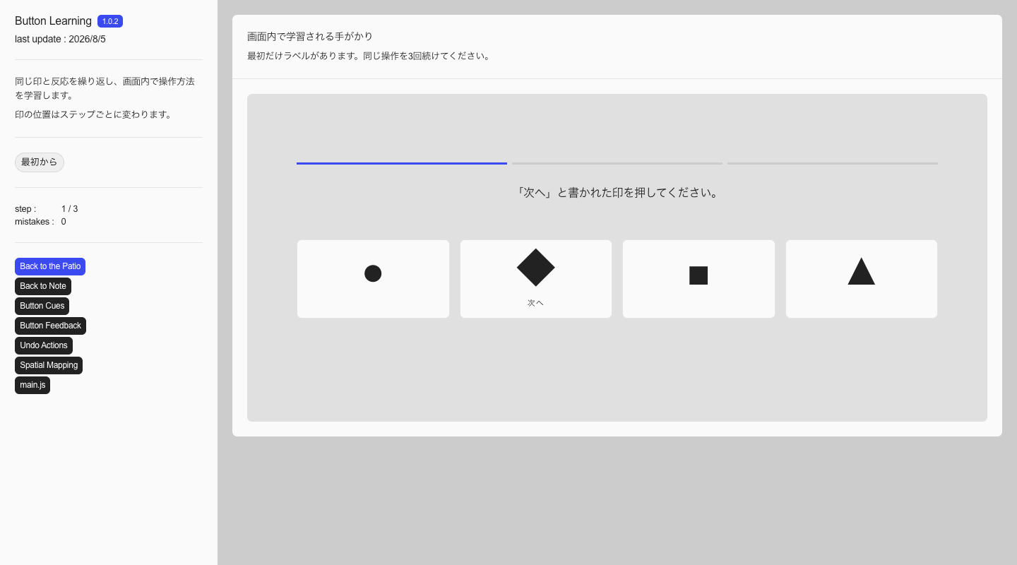
Button Learning, which simplifies this relation, adds the word “Next” to the mark only on the first screen. From the next screen the word is removed and the position changes, but the pairing of mark and response does not. It is a demo for seeing whether a relation learned in one operation can be carried into the next screen.
Learning of this kind can be included in a design only when the same person will repeat the operation and can recover from an initial mistake. I do not rely on learning on a page where the purpose is completed in one visit, or where a mistaken operation leads to an application or payment. In those places I keep a label whose meaning is clear from the first visit and a conventional method of operation.
In *The Humane Interface*, Jef Raskin treats habit formation as one of the cognitive foundations of interface design. Repeated operations can eventually be performed without conscious attention to each step. This habituation allows users to direct their attention to their original purpose—writing text or finding information—instead of continually searching for buttons. Widely shared convention draws on experience accumulated before a person reaches a screen, while a unique operation can be understood as building new experience within that screen.
At the same time, habituation also means giving the same response without checking the content. Raskin notes that repeated confirmation dialogs turn the act of confirming into a habit, so warnings cease to prompt judgment. When the consequences of an error are significant, placing a familiar confirm button is not enough; the design needs to account for what happens before and after the operation, including a way to undo it.
What matters here is not that a unique form becomes easier to use simply through repetition. If the same form and response are preserved, one experience can be carried forward. But if the same operation begins to produce a different result midway, the learned action can lead directly to an error. Whether borrowing a general convention or teaching a relation within a site, it is necessary to distinguish what should be repeated from where renewed attention is required.
Decomposing buttons
I start with an easy-to-understand button. With a fill, a border, and a short label, it usually looks pressable. When considering appearance, it may be clearer to remove cues from the same operation one at a time than to multiply finished variations.
Using the same size and wording, I keep the result of the operation consistent while switching the fill, border, shadow, :hover, cursor, and pressed state. I check at what point the button can no longer be distinguished from surrounding text, whether it becomes understandable after one press even if it was unclear beforehand, and whether something clear with a mouse becomes unclear with touch or keyboard. Switching cues one at a time lets you examine separately the elements that make something button-like.
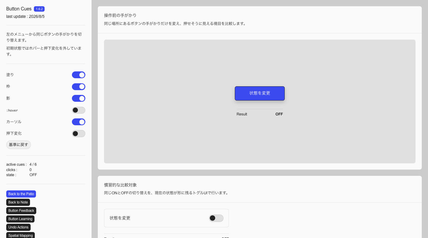
In Button Cues I assumed a UI with many operations and used a button without hover or press changes as a personal baseline.
From the left menu you can switch the fill, border, shadow, :hover, cursor, and pressed state, altering only the appearance and response of the button in the same place. Each item is a setting that retains whether a cue is enabled or disabled, so the left menu itself also uses toggle controls. In the demo body I placed another toggle that switches between ON and OFF as a comparison, making it possible to see the difference when the current state remains visible in the control itself.
Under conditions like this demo—where the background is simple, the fill, border, and label distinguish the button from surrounding elements, and the result of the operation appears immediately in the same place—I found the version without hover or press changes the most natural. In places with many operations, repeated changes in color or form whenever the cursor rests on something or a control is pressed can feel slightly unpleasant even if each individual change is small.
What I remove here is decorative feedback such as hover or shrinking. That does not mean information required for operation—focus, selection, processing, and completion—can also be removed. Focus Visible in WCAG 2.2 requires keyboard focus to be visually identifiable. Name, Role, Value requires the name, role, and state of a control to be programmatically determinable, while Status Messages covers making results that do not move focus available to assistive technology. A screen reader receives state through HTML semantics and notifications of state changes, not through a press animation.
In this demo I separate cues and observe where my own judgment changes. It does not provide a correct answer for a finished screen, but a basis for deciding what to test next. Reducing implementation and reducing verification are different things. If removing hover becomes the goal itself, the discussion can easily turn into a conflict of preference. I instead decide which responses to keep by checking whether the button can be found among the actual text and images, whether its state can be followed with a mouse, touch, and keyboard, and whether the result of the operation can be recognized. On screens with more information, a change that looked redundant in the demo may become a cue that distinguishes an operable element.
The number of button cues should vary with the effect of the operation. Where an error has significant consequences, such as confirming an application or deleting data, I make the label and state clear without teaching a unique form. For operations used repeatedly, however, redundant feedback can be reduced once the relations are consistent.
From buttons to state
Even among controls that are pressed in a similar way, what remains after the operation differs among buttons, toggles, and radio buttons. An ordinary button triggers a one-time process such as submit or save. A toggle switches between ON and OFF and preserves the current choice until the next operation. Radio buttons and segmented controls select one of several options and show the selected item in relation to the others.
The difference lies less in form than in the relation between operation and state. For example, with only a “Change state” button, you need to show elsewhere whether it became ON or OFF after pressing. With a toggle, the position of the thumb or the fill can leave the current state in the place of operation itself. On the other hand, replacing a one-shot process such as “Export file” with a toggle does not fit form to function, because there is no state to keep.
I placed a toggle alongside the button in Button Cues not only to compare button-like appearances but also to examine this difference. Beyond whether something can be pressed, deciding whether the result is a temporary process or a state that persists until the next operation changes which type of control should be used.
What matters is not appearance alone, but the sequence from showing that something can be pressed to providing feedback that the input was received. If processing is underway, show a waiting state; when it finishes, convey what changed. Even if the appearance follows convention, without a response it is unclear whether the operation worked. Conversely, even a form that looks unfamiliar at first can become a convention within the site if one operation makes the relation clear and the same response continues afterward.
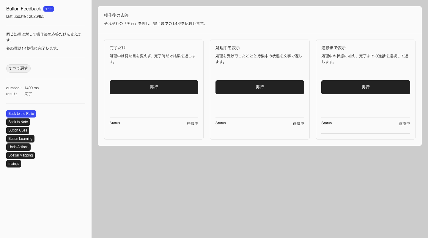
In Button Feedback I placed side by side three versions of a process that takes the same amount of time: one that returns a result only on completion, one that communicates processing through text, and one that also shows progress until completion. Even when the result is the same, feedback along the way changes how well you understand what you are waiting for.
Being able to undo an operation
Feedback after an operation serves not only to signal that input was received, but also to leave actions available for what comes next. One of those is Undo. If advance confirmation is the only way to prevent an error, users have to stop there every time. As noted earlier, when the same confirmation is repeated, pressing the confirm button itself is more likely to become a habit than reading its content.
Undo places some of the safety after the operation. If a deletion or reordering is first applied and can then be reversed after seeing the result, intended operations do not have to be interrupted by confirmation. The appropriate period for undoing something also depends on the operation. For something like a notification, where a decision immediately afterward is enough, a temporary Undo is sufficient. For document editing or layout changes, retaining a history makes it possible to trace earlier states.
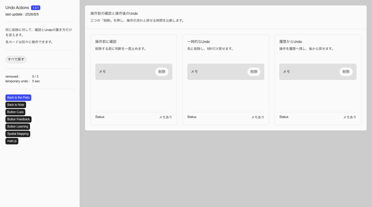
In Undo Actions I divided the same deletion into one that asks for confirmation before every operation, one that can be undone only for five seconds after deletion, and one that can be undone later from a history. The initial result is the same in each case, but the point at which you stop for confirmation and the period in which you can reverse the operation differ.
The condition for adopting Undo is not whether the screen can be returned to its former appearance, but whether the side effects of the operation can be recovered both technically and operationally. Reordering within a browser can be reversed if its state is stored. Deletion in a database requires soft deletion or a history. A request to an external API, a payment, or a permission change may not be reversible after it has been processed by the receiving system. Implementing Undo also requires the data needed to restore a state, a time limit, and consistency when several people operate on the same data.
In practice I consider reversibility, the scope of a failure, and the implementation cost of recovery separately. If an operation is highly reversible and has limited impact, I show the result first and provide Undo. If it cannot be fully reversed but execution can be delayed, I provide a draft, hold, or pending-send period. If it affects an external system immediately, I make the target and outcome clear before execution. I do not choose between confirmation and Undo as a UI preference. I first decide how far the operation can actually be reversed.
Conveying relations through arrangement
If there is only one thing to operate, a button label alone can identify the target. When several controls of the same form sit side by side, as with lights or a stove, it is also necessary to convey which button controls which target. Naming each one is possible, but matching the arrangement of targets and controls allows position itself to become a cue.
The light switches matched to a room floor plan introduced by Donald Norman are a clear example of this mapping. If four rooms sit in two rows and two columns, arranging the switches in the same way lets you choose a target by matching the room’s position to the position of the control at hand.
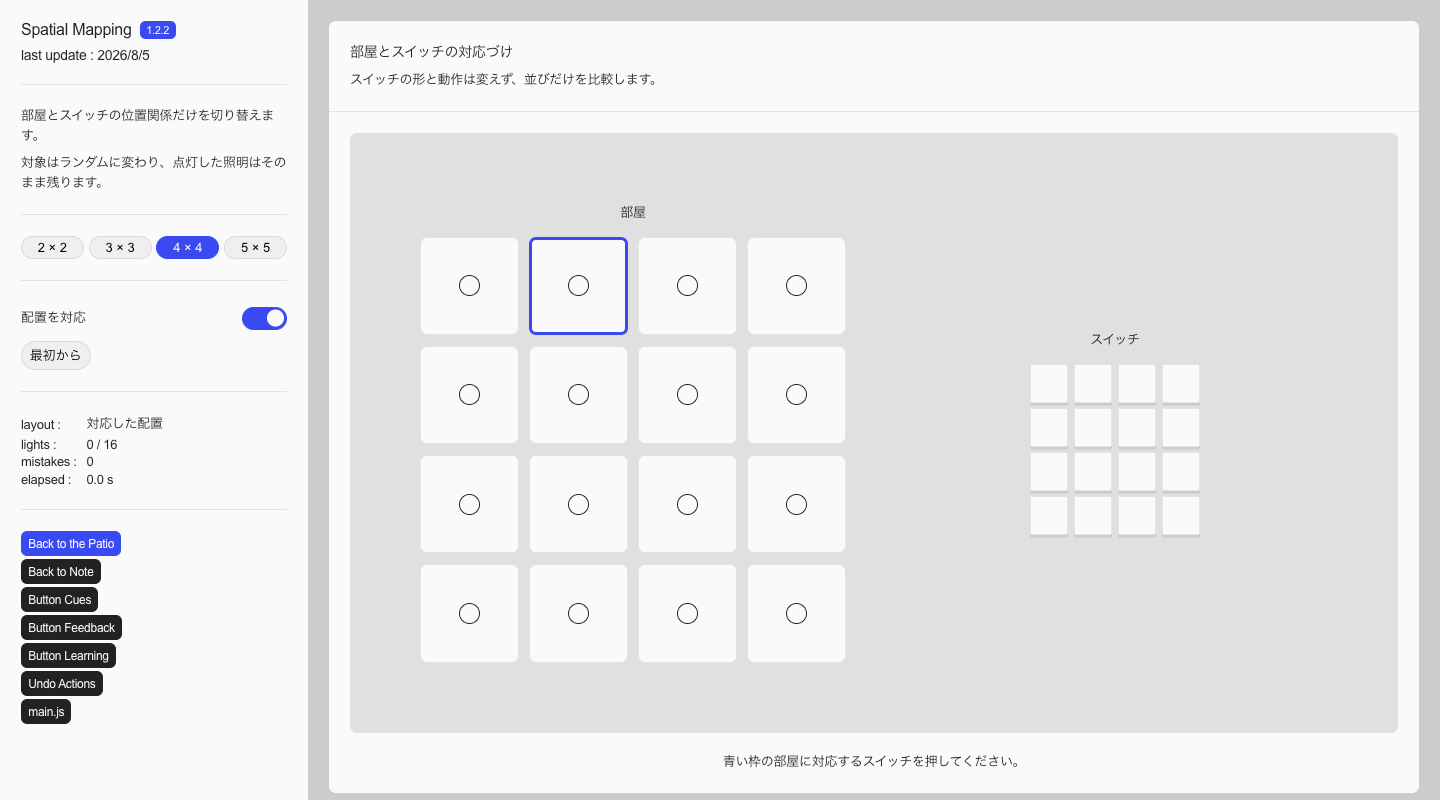
In Spatial Mapping you can switch the room and switch grids from 2×2 to 5×5. You can alternate between an arrangement that matches the rooms and a horizontal sequence that wraps to the available width. Only the arrangement changes; button size and the response after pressing remain the same. Target rooms are selected at random, and once a switch is pressed its light stays on. As you continue selecting the switch that corresponds to the room outlined in blue, the individual buttons remain the same but the arrangement changes how you follow the relation. The left menu shows the elapsed time since the first click and the number of incorrect operations.
What is being mapped here is not button-likeness but two separate structures. When choosing what to operate, align rooms and switches; when showing the current position, align the actual path with the form of the display. Even with the same idea, the role of the UI changes depending on what is connected to what.
Story structure and current place
On websites, these issues of convention and operability are joined by questions of messaging and storytelling—what should be communicated.
On HONKA REFRAME, the direction of movement on desktop changes with the turns of the story. This change of axis is there to make explicit the boundary at which the role of the information changes. The bottom-right UI placed here maps that path onto a small diagram, and before the screen moves it quietly indicates that the direction ahead will change partway through and how many sections remain.
A closer example is the current-position display under a slider. The number of dots in a row shows the total number of slides, and the recolored dot shows the current position. Even without names on the dots, because the order of the slides and the order of the dots align, you can follow the relation as you move.
In this production the turns of the story came first. The scroll axis was chosen to mark those boundaries, and the same structure was condensed into the bottom-right UI. The method of operation was left to conventional vertical scrolling, while the site-specific structure was expressed through the direction of screen movement and the current-position display.
These decisions are specific to the conditions of a brand site where boundaries in the story are shown through movement. In a SaaS management screen or an ecommerce purchase flow, where repeated daily use and quick comparison take priority, a change of scroll axis may draw attention before the information itself. The point is not to apply the form of HONKA REFRAME elsewhere. It is an example of a sequence in which a necessary shift in information leads to a change in movement, and the UI then supports the result.
What to keep
Following convention does not always make things clear. Even familiar components can leave people lost if the priority of information or the state after an operation is ambiguous. Conversely, even with screen-specific change, a relation can be understood if the method of operation is clear and its state can be followed.
In practice I separate decisions shared by a website as a whole from those needed only by UI that holds state. The following three apply first:
- Can the intended audience predict where and how to interact from the knowledge they have when they arrive?
- Does the change caused by input convey a shift in information or the direction of progress?
- Can they follow their current position and what will happen next within that change?
For operations that hold state—submitting a form, changing a setting, or deleting data—I add indications for selection, processing, completion, and failure as needed. The state should be traceable both visually and through assistive technology. How far a failure can be reversed is then decided according to the effect of the operation and the cost of implementation.
If explanation is needed to find where or how to operate, I first return the input side to convention. Especially for applications or deletion, I leave a clear label, result, and way to undo. On the other hand, when the method of input stays the same and the change of the screen itself conveys the structure of information, everything need not be aligned to familiar motion.
Leave methods of operation to existing convention, and express screen-specific structure through what changes as a result and how. Even when adding a unique UI, rather than teaching a new method of operation, I map that structure and current position onto known relations.
Convention is less a list of forms to protect than knowledge that can be borrowed before explanation begins. Form and change as seen in previous notes become cues and responses when placed into operation. What is predicted as operable, what returns when touched, and how that experience remains for the next operation. Seeing operation not as a single input but as a before-and-after relation lets you separate where to keep convention from where to form unique relations.