
Project Facts
- Project: aircord Website
- Client: aircord
- Year: 2024
- Garden Eight scope: Design, Development
- Relevant capabilities: Web design, Creative development, Three.js / WebGL, Interaction design
- URL: aircord.co.jp
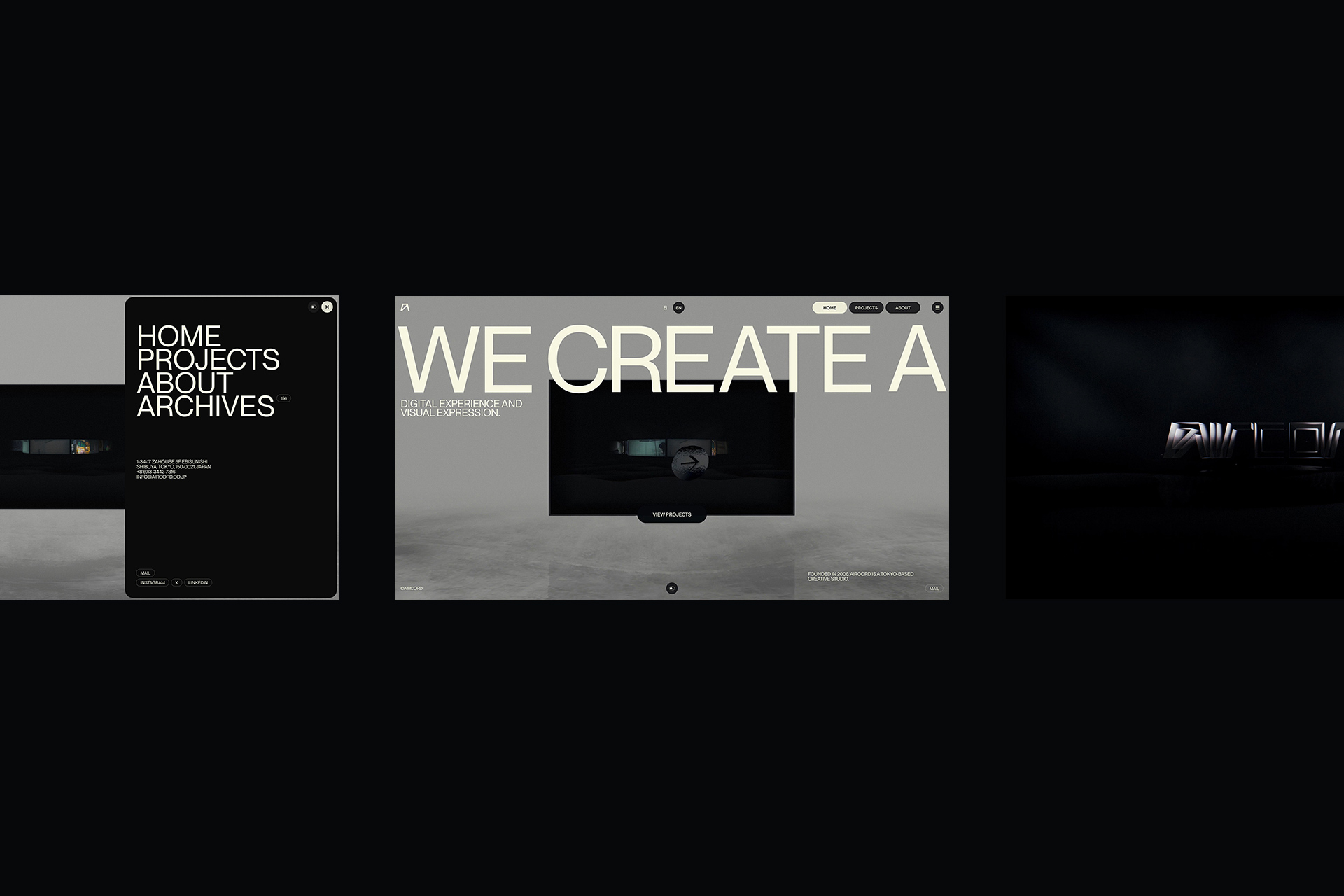
aircord is a creative studio that builds experiences with digital technology. For events, exhibitions, and facilities, it covers technical production through the development of software, applications, and hardware. On a typical portfolio site, visitors reach project information by switching from a list to a detail view. Just lining up finished work cannot capture aircord’s practice, which cuts across video, light, sound, devices, and software to act on the real world. What is needed is not stronger expression for its own sake, but depth in the process of approaching the information itself.
Page transitions that connect 2D and 3D
The core structure moves from 2D into 3D and back to 2D. Instead of adding a separate effect on each page, we send the current screen into space as a single object and connect to the next information through its surface. The same screen changes form before and after the move, so visitors enter another space while keeping their place in the site.
To make this movement work, rendering passes five layers through RenderTargets. A 2D layer containing project detail images and video is mapped onto a surface in 3D space, captured again as a 2D screen, treated as an object in space, then composited with UI for final output. By chaining multiple cameras and layers in stages, the shift between 2D and 3D can be handled as continuous motion rather than a hard cut.
Water surface in About
In About, aircord’s dimensional logo and a floor that reflects like water become the spatial reference. As the visitor scrolls, the viewpoint moves from above the water surface downward. The relationship between the dimensional aircord type, the water surface, and the camera changes with the scroll until the viewpoint enters underwater.
UI
The more complex the spatial expression becomes, the clearer the role of what visitors touch needs to be. The cursor shows the current available action—open a project, scroll, return to the previous screen—as a shape. It switches at the moment of contact, so the next movement reads without extra explanation. In 3D space, UI is treated as an object that receives the same light and material. The visual boundary between experience and control stays uncut, while the meaning of the function remains.
Mobile
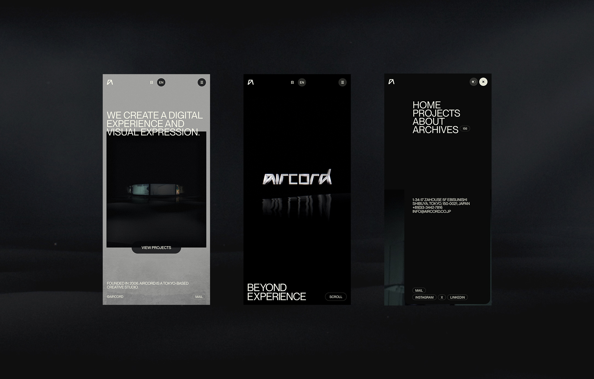
The same idea—keep the core experience and simplify the periphery—carries over to mobile. The main constraint here was not screen size, but rendering performance and different input methods. Shrinking the desktop setup as-is can look similar while the focus of the experience blurs. So we kept the core structure of moving between 2D and 3D while reducing layers that do not directly aid understanding. What to keep as experience. That selection took the most time.
Technical notes
The following notes focus on implementation. Three points were central: RenderTargets that connect screens, how text is handled, and a cursor that belongs in the space.
On RenderTarget design
Continuity across screens came first, so rendering is split into five layers. Furthest back, Single Page draws project detail images and video. Page maps that result onto a surface in 3D space, and Screen captures it again as a 2D screen. World treats that screen itself as an object in space, then UI is composited for output to the browser.
Each layer receives the previous RenderTarget as a texture. Even when the same screen switches between being shown as a plane and being placed in space, the content does not break. The structure is more complex, but the look during transitions can be tuned on a single timeline instead of preparing a separate effect for each page. Design and implementation could also be validated on the same screen.
On text rendering
Not all text belongs in WebGL. Text meant to be read as information stays in the DOM. Text meant to appear as part of the space uses TextGeometry, SDF, or Icon depending on its role. The criteria for choosing a method are sense of volume, resilience under scale, and how clearly interaction reads.
TextGeometry
The aircord logo in About uses TextGeometry. Converting letter outlines into vertices adds depth, so the logo can be treated as an object affected by camera and light, including reflection on the water surface. Vertex count grows with character count, so it is a poor fit for long copy. We limited it to a logo where dimensionality itself matters, and kept home typography and body text in the DOM for readability.
SDF
Project titles use SDF. Distance from the letter outline is stored in a texture and the edge is reconstructed in the shader, so edges hold up when camera distance or display size changes. Each letter does not need a complex solid form. Titles scale and rotate with projects arranged in a ring while remaining readable when they face forward.
Icon
Cursor shapes were drawn in Illustrator, converted to an icon font, then given volume with TextGeometry. There is no need to load a separate 3D model for each shape such as arrows or scroll cues; required forms can be generated from a single font. When the shape changes, size, depth, and material stay under the same conditions, which supports consistency as well as a lighter load.
Glass-like cursor treatment
The cursor is UI that signals function and, at the same time, a small object that receives light in the scene. It stays transparent to the background while keeping reflection on the edge, so it remains readable over dark footage. The same material carries over when the shape changes, so the look does not break even when the operational role changes.
With current Three.js, MeshPhysicalMaterial transmission can produce a similar quality with relatively simple setup. Transmission still depends on rendering what sits behind it, so cost changes with full-screen post-processing and DPR. What matters is deciding the required size and display duration first, not only matching the look.
Exchange between design and implementation
What these techniques share is not adding more 3D, but keeping the order of knowing aircord unbroken. RenderTargets connect page boundaries, the water surface turns depth of information into scroll, and the cursor keeps the meaning of interaction inside the space. On mobile, only that order remains while peripheral rendering is reduced.
There was not a finished design first and an implementation that reproduced it later. We moved camera, type, light, and transitions in the browser while judging what was necessary as an aircord experience.
Recognition
- Awwwards — Site of the Day, Developer Award
- The FWA — FWA of the Day
- CSS Design Awards — Website of the Day
Credits
- Client: aircord
- Designer / Developer: Kenta Toshikura (Garden Eight)
- Producer / Director: Toshiyuki Hashimoto (aircord / The Shift)
- Copywriter: Jiyu Park (The Shift)
- ※ This article is an AI translation of the Japanese original.